The Brief
Huon’s existing brand wasn’t true to their offering. It also didn’t alleviate the concerns and complexities of aged care.
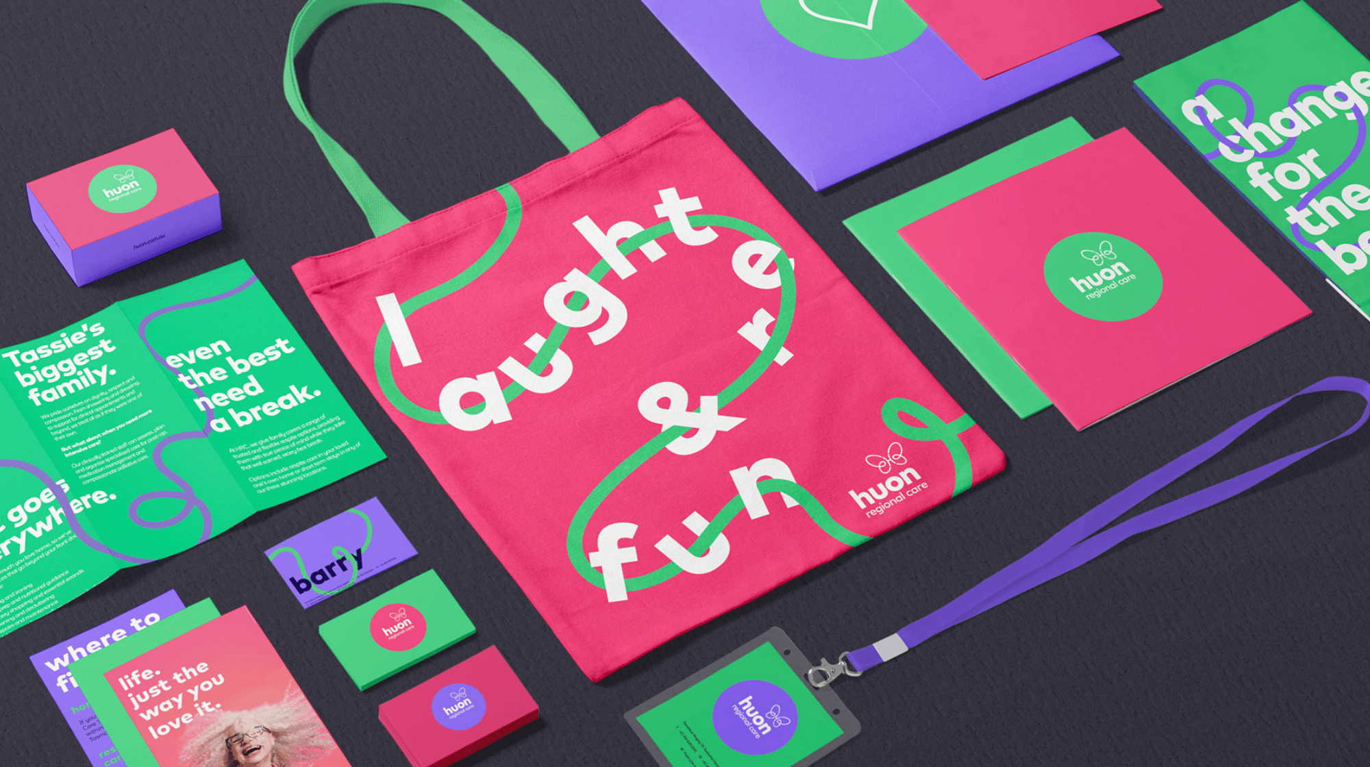
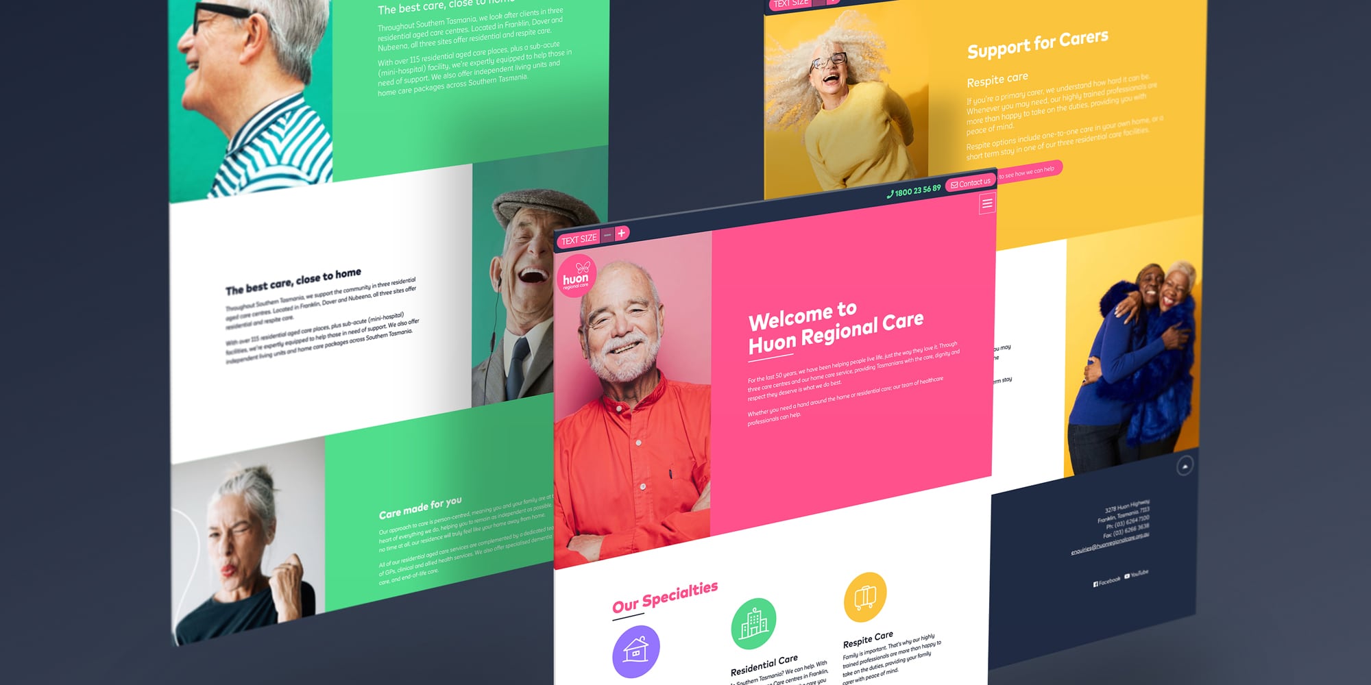
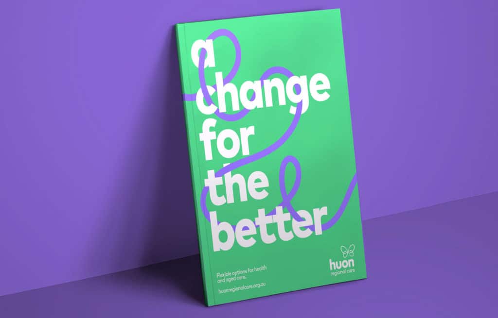
Our brief was to rebrand Huon Regional Care in its entirety. This included their website, colour palette, style guide, tone of voice, signage, pamphlets and sales collateral.
Health care, palliative care, residential care and ageing can be complex and often very emotional. Our approach was to reposition this process as a change for the better.
Flipping the connotation of aged care from negative to positive allowed us to diffuse any stigma immediately while having the flexibility to talk about Huon’s breadth of services.
The Process
The Work
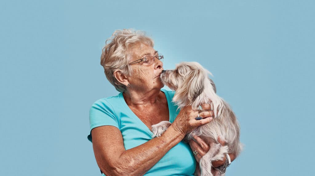
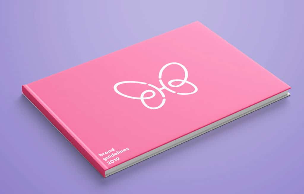
We developed a new logo and visual identity that encapsulated the idea of positive change in a simple and relatable way. That, coupled with well selected and shot photography, repositioned Huon Regional Care to be different in a category riddled with outdated thinking.
Aged care is a personal matter for all involved. As such, we opted for an authentic storytelling route for our video assets, as opposed to a traditional sales message.
Why it Worked
“Common Ventures have created a strong and clear brand for our business reflecting our broad range of services for elderly Tasmanians. We’re delighted with the result and will be rolling it out across the business in coming months.” – Barry Lange, CEO at Huon Regional Care

